
What does colour say about your brand's visual identity?
ByClaire Fuller |MarketingCreativeFundraising |26 September 2018- How long did it take your organisation to decide on the colour of it’s logo or latest campaign?
- What is your favourite colour and why do you like it so much?
The process of building a visual brand identity has always intrigued me. The development of a logo can take many hours as alternative options with different shapes, styles and fonts are considered, and that’s before you even get started with the colour!
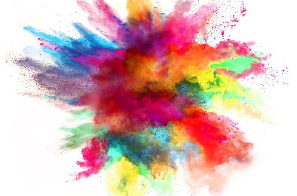
The choices of colours used in design and brand development are about much more than what looks good on a page. Use of different colours can stir up emotions and bring particular memories and feelings to mind, encouraging your audience to find out more, or to stop engaging with a product at all. The same logo depicted in different colours can even cause people to feel more or less positive about a product!
Why is colour so important?
There’s no guarantee that a particular colour will make EVERYONE think and feel the same because individuals bring their own preferences, emotions and culture into their experiences. But there is a psychology to colour which indicates broad perceptions (or trends) in the perceived appropriateness of colours used.
In a 2012 study called “Impact of colour on marketing” researchers found that from 62-90% of spontaneous decisions about products can be based on colour alone.
What colour should you choose?
There are four psychological primary colours (red, blue, yellow and green) and they relate respectively to the body, the mind, the emotions and the essential balance between these three.
Colour psychologists would indicate that our broad perceptions of some popular colours can be as follows:
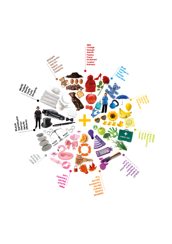
As the above shows, colour can connect to strong feelings and emotions making your choice of colour a powerful marketing tool.
It’s therefore no wonder that when colours are chosen for a brand or for campaign materials there is much thought around why a particular shade should be used. Don’t forget that the dominant colour on a page can be a key factor in setting the tone of your message, drawing the eye of your audience and influencing whether they choose to interact with you or not.
Does your brand need a refresh?
If you’re looking to inject some new colour into your brand, or would like to explore ways to stand out from the crowd when approaching your audience please get in touch with us. Our creative team has years of experience in helping organisations make a great impact and we’d love to help you too!
Acknowledgements/References
Creative Inc
Help Scout
Emerald Insight
Colour Affects
Access


Comments