5 steps for creating a logo which makes the right impression
ByClaire Fuller |CreativeMarketing |15 September 2016For many organisations or products, a logo is an important tool for recognition and to convey the values, beliefs and functions of their brand. Many people see a logo before they have a personal encounter with an organisation, product or service, so they may form an initial opinion based purely on the name of your organisation, the design of the logo and what they believe these say about you. Having the correct logo is therefore a vital way to make a good first impression and help your target audience(s) make informed decisions about your organisation.
What is a logo?
The Oxford dictionary defines a logo as “a symbol or other small design adopted by an organization to identify its products, uniform, vehicles, etc”. Over the years, logos have been used to convey specific messages and to enable people to easily recognise and identify with particular organisations or products. For a logo to have the greatest impact it needs to be original and memorable and that’s where our team of skilled graphic designers can help you, taking you through a step-by-step process and considering the following:
5 steps to creating an effective logo
- Make your logo visually appealing – Each element used within your logo will affect the way that it is perceived
- Consider what colour (or colours) will be included in your logo– Colours or shades can be associated with different meanings and inadvertently affect the message being conveyed to your audience. For example:
- Blue – Depth and stability of sky
- Red – Intensity of blood and fire
- Yellow – Energy and joy of the sunshine
- Green – Harmony of nature
- Purple – Luxury of Royalty
- Orange – Happiness of sunshine and the tropics
- Black – Formability and mystery of night
- Pink – Feminine traits
- Brown – Nurturing trait of mother earth
- Consider which font (or fonts) will be included in your logo– In a similar way to colour, different types of font are known to convey different types of message. For example:
- Script decorative fonts – Designed to look like they were handwritten – often a popular choice for titles and headlines
- Calligraphic decorative fonts – Generally not designed to be readable, balancing the ability for readers to understand what you are trying to say with the emotional impression the fonts create
- Graffiti decorative fonts – Built to look like someone spray painted the letters. A subtle choice for title lettering that’s bold yet exciting
- Make your logo original – Having a logo that is unique will enable people to differentiate it from other organisations, particularly your competitors. Images that are eye-catching are more likely to be remembered so having an original design will encourage people to remember your logo and organisation
- Make your logo clear and well designed – A logo that’s professional and clearly designed may convey a more positive message than a rushed/casual design. If a logo is not created to a high standard your audience may think that the service of your organisation is not as professional as your competitors. However, it is also worth remembering that a good logo should reflect your organisation, therefore a sharp, corporate logo may not give the correct impression if your organisation wishes to convey a more casual, relaxed approach
5 logo styles to consider
When choosing the style of your logo, there are 5 main types to consider, as illustrated with some well known examples below:
 |
Symbol/icon – This is a logo that represents the business in a simple yet bold way. It is often used because the human mind can remember a simple form much easier than a complex one |
 |
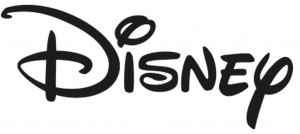
Word mark – These are styled text logos that will spell out the name of the brand |
 |
Letter mark – This is when a symbol is used to represent the organisation through its initials or first letter. Many companies choose to use this type of logo because their full name is too long, or the name is hard to pronounce |
 |
A combination mark – These contain both a Wordmark and a symbol and adds flexibility to your logo as the different elements can usually be used together or separately |
 |
Emblem – A logo that encompasses the company name within the design |
Should your organisation use a logo?
A visual element like a logo can enhance your ability to stand out in the marketplace. If a logo is correctly used across your organisation (e.g. brochures, websites, stationery, social media accounts, merchandise) it can help to:
- Unite different aspects of the organisation
- Display your organisation/product in a professional way
- Build trust in your organisation/product
- Build brand identity and help people associate meaning with your organisation
- Ensure your audiences are clear about the values and functions of your organisation
- Make your organisation distinctively and quickly recognisable
Having designed a logo, it’s important to ensure it makes the correct impression, therefore our experienced team can work with you to create brand guidelines to be used as a toolkit by any competent graphic designer. Brand guidelines detail how (& how not) to use the logo, colours, fonts, photos and any other graphical elements to ensure that your brand is visually represented correctly at all times. Creating and using brand guidelines will greatly reduce the risk of a logo being used incorrectly and potentially jeopardising the impression that people receive about the organisation.
For help with defining your brand and designing your logo and to see examples of our work on brand guidelines and logos please contact us and talk to Phil.
References/Acknowledgements:
nodinx.com
entrepreneur.com
qualitylogoproducts.com
instantshift.com
Images courtesy of istock


Comments